Tech Report:
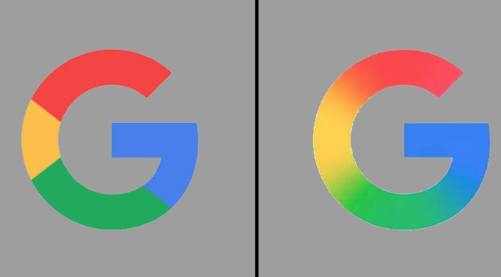
In the old icon, the letter ‘G’ was made up of four distinct color blocks. In the new icon, a gradient is used instead of that block color, which changes from one color to another step by step. In this new version, instead of the four different color blocks as before, the colors blend into each other in a gradient form—from red to yellow, from yellow to green, and from green to blue.
However, there is no indication of any change in the current Google’s original six-letter logo. However, technology experts believe that Google may use such a gradient style in Chrome, Maps or other four-color logos in the future.
The change Google made to
This new icon is currently visible in the icon of the Google Search app on the iOS platform. It has also been added to the 16.18 (beta) update of Android. However, as of yesterday, Monday (May 12), no sign of the new icon was seen in other Google branding elements.
Apart from this, the shortcut icon in the AI mode of the Google Search app also follows a similar design.
Google has not officially commented on this.
Incidentally, Google’s annual developer conference, Google I/O 2025, is going to start on May 20. Therefore, technology analysts believe that the timing of the unveiling of the new icon is important.
In September 2015, Google unveiled the colored block version of the current ‘G’ icon for the first time. At the same time, they also changed their original logo and started using a typeface or font called ‘Product Sans’. At the same time, the current round colored ‘G’ icon was introduced instead of the previous white lowercase ‘g’ on a blue background, which we have seen for about 10 years.
At that time, Google stated in a blog post, ‘The Google logo and branding were originally created for a desktop browser page. Now we have adapted it to a world where seamless computing is possible across multiple devices and input methods.’
Ruth Kedar, the first designer of Google’s original logo, said in a 2023 interview that the initial logo’s font was designed to honor the heritage of the past while looking to the future.
However, this change indicates that Google is moving towards a more modern and dynamic branding.
Source: USA Today and Nine to Five Google


